If you read my first article about the lessons I have learnt about UI/UX since starting out, then you probably already understand the importance of design principles.
In that article, I wrote about Design Principles being;
The basic, must-know rules that guide the creation of good designs.
In case you missed that article, you can find it here
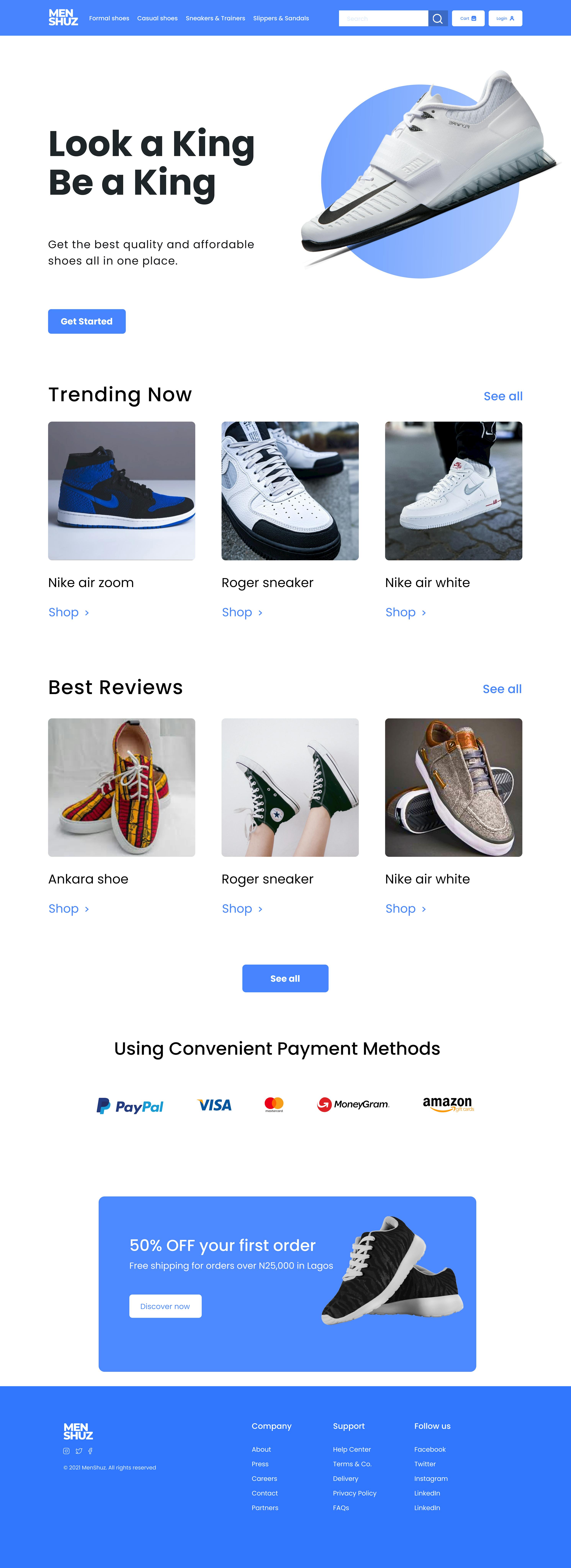
I am going to skip right past the fluff and jump into how I have applied some simple design principles in creating a landing page for an e-commerce store focused solely on Men's shoes. I know I wrote design principles, but I won't be able to exhaust all design principles that there is in this one piece of writing. I will simply touch on a few that applies to this example. You might be wondering, isn't a design supposed to have ALL the design principles in them for it to be an actual design? Well, the answer is NO. You do not have to apply ALL the principles in every single design that you do. However, if you are going to apply one or more principles at all, they should be done (applied) properly.
A Little Background Story
Alright, some background information before we jump into the design principles. I know I said no fluff but I feel like you should know how I came about the design of the landing page. 👇 Moreover, it will help you understand some decisions I made later on.

The entire process was based on research, although not technically the type of full-blown research one would expect for a UI/UX design. The approach of my research was a wee bit different from the conventional method and you'll get to see why in the next few lines.
Stage 1 - Task received + Idea stage - I was given a task at the UI/UX Study Group where I am currently a member to design any landing page at all. I opted for designing an e-commerce landing page and further narrowed it down to be specifically targeted towards men.
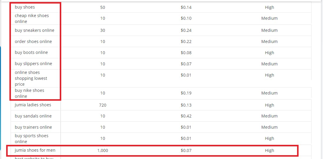
Stage 2 - Research - I started by leveraging the biggest search engine in the world, Google, to discover what people's biggest questions were as regards buying men shoes online. I achieved this using Keyword Research The information obtained was rather eye-opening as it did not only give me some answers, it also exposed me to competitors that were already leveraging these keywords for the search engine optimization of their e-commerce sites.

From this discovery, I noticed that there are several categories of men's shoes. I decided to narrow down to SNEAKERS as they appeared to be the most in-demand, based on my findings.
Next, I set out to answer some tough questions. Some of these questions were:
- What do men look for when shopping on an e-commerce site?
- What informs their [shoe choice] when shopping online?
- How do they go about the entire process of shopping (generally) online?
- How do they relate to contents on the page - do they read them or simply skim through. If they do read them, what's the most amount of content they can consume at a goal?
- How long (in minutes) do they spend making buying decisions - i.e going from spotting a product (shoe) that they like to finally placing the order?
- What further research do they do to get more information - do they read up more about the product, check competitor's site and read reviews?
- Do they come looking for a product they already had in mind, therefore, they just want to search for it, add to cart and zoom off? (This would mean I should consider having a conspicuous search bar right at the top of my page)
- Do they come in just to check for prices?
- What colour(s) appeals to men and plays into their decision to place the order.
I know! I know I should talk to prospective users and maybe conduct a survey, however, as stated earlier, this is not a full-blown research. This only explains my thought process when I envisioned the landing page and the direction my research was basically headed.
Getting Answers
To answer all of these questions I needed to take a keen look at understanding men's behaviour on e-commerce websites.
The findings were quite an interesting one. I have summarized all key points in a few short sentences.
Men tend to perceive shopping online as a mission that needed to be completed with the minimum time and effort. Therefore, they spend less amount of time (in comparison to women) comparing products upon products.
They expect websites to be well-structured, easy to navigate and provide them with the expected result with as little inconvenience as possible. Well, everyone expects this. Everyone deserves this.
Most times, before even visiting your website, they already have an idea of what they want to purchase. This means you need to have an easily navigated set of categories so they can find what they want immediately.
Putting all these together, I concluded that the male gender would love an easy-to-navigate website where everything just works and things can be found when they are needed. So, I came up with a list of things that should be on the website
- A clear navigation showing all products offered.
- A search bar (very important)
- A simple UI
- Short, clear contents that tap into the words that they would normally use when searching on Google.
Other decisions I made include;
- choosing blue as it is more of a colour for men, and
- using the keywords used when searching for shoes online. These keywords include Best, affordable and quality shoes.
Stage 3 - Getting Inspiration - I observed competitors websites majorly. I also used dribble.
Whew! That was a long one
Now, Applying Design Principles Proper
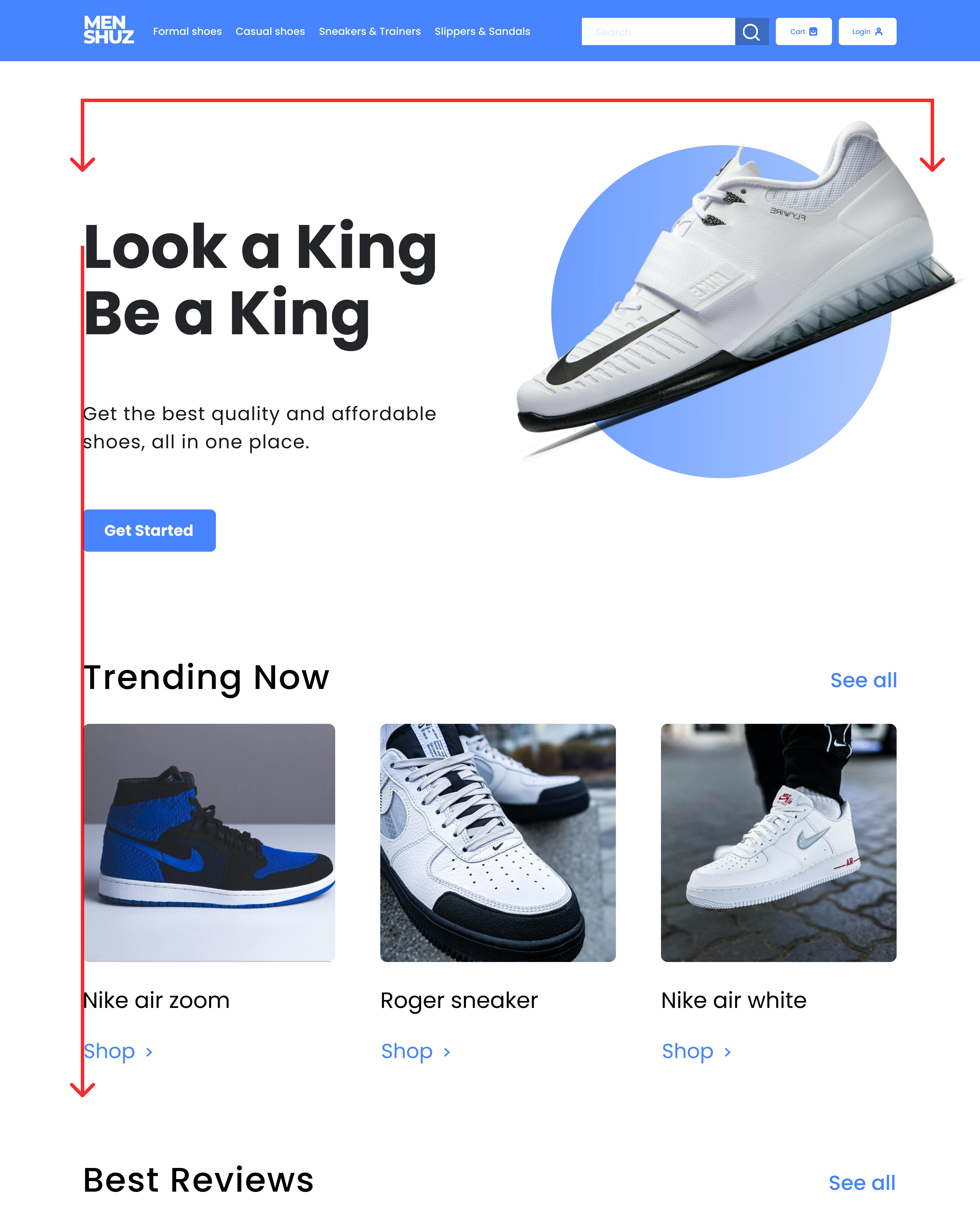
Starting with the hero section of the design, I tried to visually balance the elements (text, image & circle) such that elements are not busy on one side of the page while the other side is scanty. The image and circle at the right thus balance out the bold text on the left as shown by the red horizontal square bracket. This design principle is called Balance.

Also, a strong vertical alignment can be seen running down through the page. This emphasizes Alignment as a design principle. Looking through the page you will also notice a strong horizontal alignment. Can you spot it?
The third design principle used here is Contrast. Different contrast exits between the different elements. For example, there is a contrast in type at the hero section with the main text in big bold Poppins and the supporting text in a way smaller size. A contrast in composition is also seen with the Text and image. There is also a strong contrast in colour - the blue against the white and black.
Certain elements, such as buttons were repeated throughout the design. This could be called Repetition.
Finally, I ensured that whitespaces were used to guide the viewer's eye at it runs through the page.
...And it's a wrap! 🎉🎉
If you read up to this point, you have earned a special place in my heart.
Connect with me on Twitter and LinkedIn. I look forward to talking with you.
